
Keywords: video brochure design1, high-converting brochure2, marketing brochure tips3
A video brochure isn’t just a marketing gimmick—it’s a sales tool. When done right, it becomes a silent salesperson that delivers your message, stirs emotions, and drives real action.
But here’s the catch: not all video brochures are created equal. If your design is off, even a great video may fall flat. So, how do you design a killer video brochure that actually converts? Let’s break it down.
1. Start with the End in Mind
Before you jump into artwork or button placement, ask yourself:
“What do I want the recipient to do after watching this?”
Whether your goal is to schedule a meeting, visit a landing page, or make a purchase, this desired outcome should shape the entire design.
Tip: Choose a CTA (Call-to-Action) and build around it—visually and in your script.
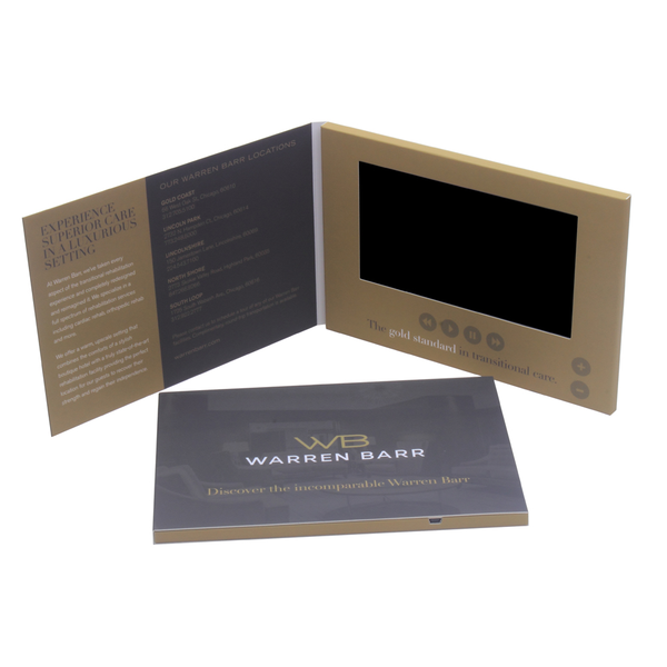
2. Choose the Right Screen Size for Your Message
Not all screens are created equal. Bigger isn’t always better—but appropriate is.
- 2.4"–4.3”: Great for teaser messages or compact invitations
- 5”–7”: Ideal for product demos, training, or testimonials
- 10”: Perfect for high-impact sales pitches or complex storytelling
Tip: Match screen size to the emotional depth and detail of your content. Don’t squeeze a luxury real estate walkthrough onto a 2.4" screen.

3. Design the Cover to Trigger Curiosity
The outside of your brochure is your first impression. It should hint at value, quality, and story—without giving everything away.
Do:
- Use high-resolution images
- Incorporate embossed logos or soft-touch lamination
- Add a bold headline or provocative question
Don’t:
- Overload with too much text
- Use generic stock imagery
- Forget your brand colors and fonts
4. Make the First 5 Seconds of Your Video Count
Your video starts automatically when the brochure opens. That’s prime real estate—don’t waste it on logos or slow fades.
Tip:
- Open with emotion, a pain point, or a bold statement
- Hook the viewer before they even know what’s happening
- Reserve logos for the end, with a strong CTA

5. Keep Controls Simple and Intuitive
Too many buttons = confusion. Your audience doesn’t want to figure out how to play a video—they want to watch it.
Options to consider:
- Auto-play on open (most effective)
- Play/pause + volume buttons (minimal setup)
- Custom buttons for multiple videos (only if essential)
Tip: Label buttons clearly if used—think "Play Demo" instead of just a ▶️ symbol.
6. Align Your Visual and Verbal Messaging
Your print design and video must feel cohesive. If your brochure says “luxury,” but your video looks like a PowerPoint, you’re creating dissonance.
Checklist:
- Same fonts and colors across print and video
- Consistent tone of voice
- Brand logo and tagline shown in both mediums
Tip: Ask your designer and video editor to collaborate—or use an integrated team like CheerTrend offers.

7. Personalize Where Possible
Personalization is a conversion booster. Even just addressing the recipient by name in your print or video can significantly increase engagement.
Advanced personalization ideas:
- Custom videos for different industries or client tiers
- Dynamic QR codes that lead to user-specific landing pages
- Unique messaging for sales vs. product launches
8. Use Print Techniques That Reflect Value
Your design should feel like an extension of your brand—visually and physically.
Consider:
- Spot UV for logo highlights
- Embossing/Debossing for texture
- Soft-touch lamination for a premium feel
- Die-cut windows to tease the screen
Tip: These finishing options increase perceived value—and therefore response rate.

9. Test Your Layout with Real Users
Before you print 500 brochures, test your prototype with people who match your target audience.
Ask them:
- What’s the first thing they notice?
- Do they understand what to do after watching?
- Would they keep or discard it?
Use this feedback to fine-tune your layout, content, and message.
10. Always Include a Strong, Visible Call-to-Action
The biggest mistake? Ending the video with a logo and silence.
Instead:
- Tell them what to do next—“Schedule your demo today,” “Visit our website,” “Scan to learn more”
- Print the CTA on the inside flap or below the screen
- Make sure it’s clear both in the video and on the brochure itself
Conclusion
Designing a killer video brochure isn’t just about fancy visuals—it’s about strategy, clarity, and psychology. Every design decision should support one ultimate goal: conversion.
By following these principles, your video brochure can become a high-performing tool that not only grabs attention—but converts it into action.
Want help creating your next killer brochure?
👉 Reach out to our team at CheerTrend for full-service design, video integration, and expert support.
📧 Contact: Anna@cheertrend.com
🌐 Website: www.cheertrend.com
-
Explore this resource to discover essential tips and techniques for creating effective video brochures that engage and convert audiences. ↩
-
Learn from experts on how to design brochures that not only attract attention but also drive conversions effectively. ↩
-
This link will provide you with valuable insights and strategies to enhance your marketing brochures for better results. ↩